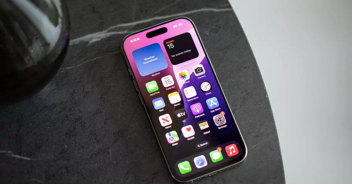
In a world increasingly dominated by technology, the way we interact with our devices significantly affects our productivity, mental well-being, and overall user experience. As smartphones become more integral to our daily lives, the organization of their interfaces—especially the homescreen—can make a notable difference. One trend that has gained traction, particularly among iPhone users, is moving away from a crowded grid of app icons toward a more curated, minimalist approach. This article explores the transformation of homescreens, the motivations behind going off-grid, and the implications for digital user experience.
For many, the traditional grid filled with app icons serves as a comforting structure—a familiar canvas where everything is neatly organized. Over time, however, this structure may evolve from a useful organizing tool into an overwhelming source of distraction. As smartphones grew more powerful, accumulating more apps became commonplace, leading to homescreens that felt more cluttered and oppressive than inviting. The once manageable ten apps mushroomed into sixty or more, resulting in rows of colorful icons demanding constant attention.
The very design of a typical smartphone interface, especially in iOS, makes it difficult to escape this grid-like confinement. With the advent of iOS 14, Apple introduced features like widgets and the app library—changes that offered glimpses of flexibility but often felt like half-measures. Despite these improvements, many users continued to revert to the grid system, hindered by a lack of intuitive muscle memory for a more organized and personalized interface.
The launch of iOS 18 brings even more options for customization, allowing users to arrange apps and widgets freely. This newfound freedom has inspired those feeling suffocated by the traditional interface to explore minimalist homescreen designs. The move toward a more personalized and functional design reflects a broader desire to reduce digital clutter and reclaim focus.
One compelling motivation for this transition is the realization that not every app needs to occupy valuable screen real estate. For instance, why keep an app that is rarely used, like a parking assistant, on the main screen year-round? This line of thinking can lead to a radical decluttering of the homescreen, as users evaluate the necessity of each app. The result is often a streamlined layout featuring only the most essential apps and widgets—a design philosophy that emphasizes functionality over mere aesthetics.
The journey toward a cleaner digital workspace can be both liberating and daunting. Many users, like the author of this exploration, have found comfort in minimizing the visual noise of their screens. After dedicating time to curating their homescreen, users discover a more tranquil experience where app notifications no longer overwhelm them. Instead of relying on incessant notification badges, the decision to pare down app visibility leads to a more focused and productive smartphone experience.
Insights from other individuals pursuing the “off-grid” philosophy further underscore this shift. Colleagues emphasize the importance of not being drawn in by visual clutter; they prioritize utility over the distracting availability of numerous apps. For example, one colleague has engineered a homescreen that harnesses the power of shortcuts rather than displaying conventional app icons, allowing for an organization categorized by type of task rather than by app. This allows for quick access while minimizing distractions from time-consuming social media or entertainment options.
While the push for a minimalist digital space has been prominent, the role of artificial intelligence in enhancing user experience cannot be overlooked. With innovations in search functionality and predictive algorithms, users increasingly rely on built-in features like Siri’s suggested apps to quickly access what they need without grappling with a crowded screen. The efficiency of these intelligent tools complements the movement towards a streamlined digital experience, showcasing the potential for technology to adapt to user needs.
As individuals embrace more personalized app organization, a fascinating paradox arises. Users who consciously reduce visible app clutter also enjoy greater efficiency in locating apps when needed—often without needing to explore the cumbersome app library. This adjustment leads to new patterns of use that values function over superficial appearance.
The shift towards minimalist homescreens isn’t merely a fleeting trend; it’s indicative of a broader desire to align technology with personal well-being. The journey from the traditional grid to a customized digital environment is emblematic of a search for balance in an increasingly noisy digital landscape.
As smartphone interfaces continue to evolve, embracing minimalism can pave the way for a future where technology enhances rather than hinders our lives. The verdict is clear: personalizing your digital space can play a significant role in increasing both productivity and satisfaction. By adapting to new features and rejecting unnecessary complexity, individuals can navigate their digital worlds more effectively, ultimately leading to a healthier relationship with technology.


Leave a Reply