
Apple has always maintained a reputation for revolutionizing the tech landscape with its groundbreaking innovations. The announcement of the Liquid Glass design language at WWDC 2025 is no exception, capturing attention and sparking discussions across the tech community. But as we dive into this transformation, it’s paramount to ask: Is this ambitious leap a genuine advancement or merely an aesthetically pleasing distraction?
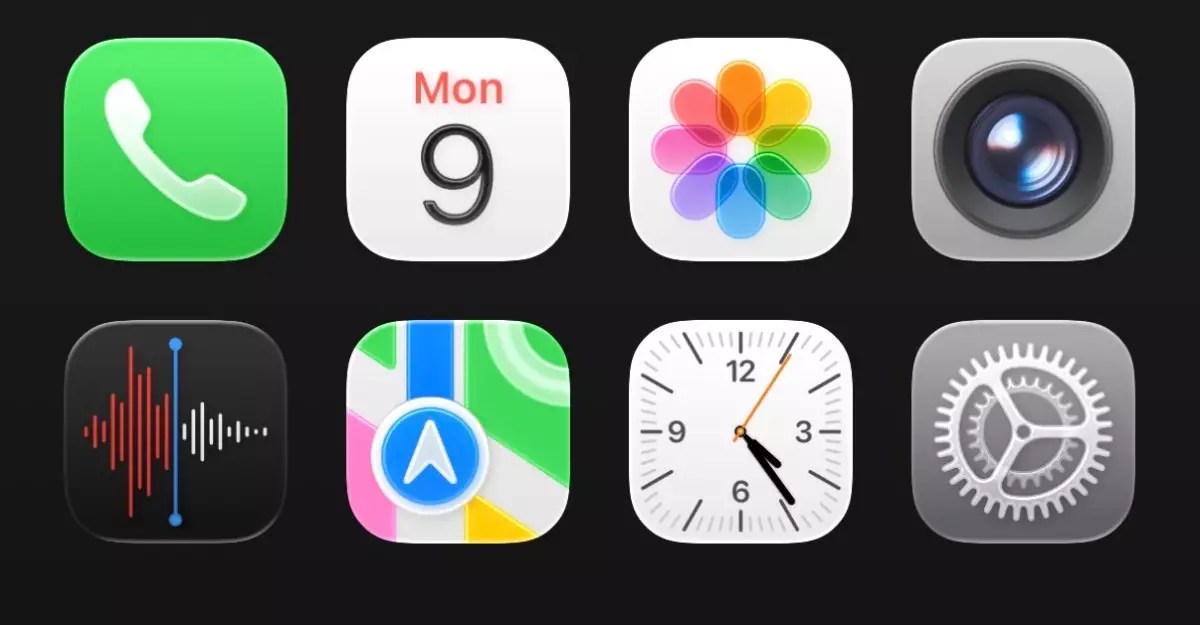
Liquid Glass strives to create a sense of fluidity and transparency, as app icons and interface elements appear to float above the background content on devices. This novel concept may seem nondescript at first glance, but the execution is anything but subtle. The graphics are undeniably eye-catching, offering a modernistic sheen that’s almost hypnotic. However, as engaging as it may be, the design raises concerns regarding practicality and user experience.
The Good, the Bad, and the Shiny
At the heart of this design overhaul is a clarity that aims to integrate seamlessly into users’ daily lives. When compared to the previous iteration, iOS 18, the transition to this new look is stark. The vibey translucence introduced in iOS 26, while dazzling, threatens to obfuscate the clarity which is essential in a user interface. The transparency might evoke a modern aesthetic, but does it truly enhance functionality? The jarring contrast when toggling between different screens could leave users disoriented, as vital information may become lost in the glitz.
For instance, while the rounded tab bars and bubbly icons might seem exciting, they also portray a glaring issue of overcrowding—particularly in crowded spaces like the Control Center. The aim should be to enhance usability rather than create a cluttered visual experience that complicates quick navigation. Thus, it becomes crucial for designers at Apple to strike that elusive balance between beauty and user-centric functionality.
Familiarity with a Twist
Apple’s design ethos has always danced on the line between familiarity and innovation. With the Liquid Glass look, the inherent challenge is that while many elements remain recognizable, the alterations could throw longtime users for a loop. Those who have grown accustomed to the streamlined visuals of previous iOS versions may find themselves overwhelmed by the newness of it all. The adjustments—like the varied oval icons and the animated selectors—add a playful touch, but they risk alienating users who prefer their experiences straightforward and unobtrusive.
Apple has long prided itself on the detail-oriented nature of its interfaces. Yet, the current iteration of this design feels unrefined, almost as if it hasn’t yet fully matured. Consider the keyboard redesign and the spacing issues experienced within other applications. These elements can detract from the overall aesthetic unity, leaving users feeling as if their devices are suffering from uncoordinated styling.
Futuristic Yet Flawed
There’s something inherently compelling about the audacity of the Liquid Glass design. It embodies a vision of the future—a brave step into the unknown that challenges the norm. Yet, with audacity comes the responsibility to fine-tune these designs to ensure broad applicability in the lives of everyday users. The risk is high; while innovation is celebrated, execution remains vital. Users may appreciate novelty, but they demand a device that can respond to their needs efficiently.
As Apple moves toward the official release of iOS 26, the road ahead is one of critical examination and, hopefully, adaptation. User feedback following this beta phase is pivotal, as it allows Apple to reassess introduction elements that either elevate the experience or hinder it. The notion of fluidity is inspiring; enabling seamless interactivity could redefine iOS experiences. But it is crucial they rectify these concerns to maintain Apple’s status at the forefront of the tech industry.
In the end, Liquid Glass symbolizes a junction—a brave departure from tradition that is not beyond repair and infinitely fascinating. As with any great leap in design, the intersection of beauty and heightened usability must dominate future updates if Apple wants to maintain its industry-leading role.
Leave a Reply